The icon design language and app icon for Nabertherm
A digital brand within minimum space
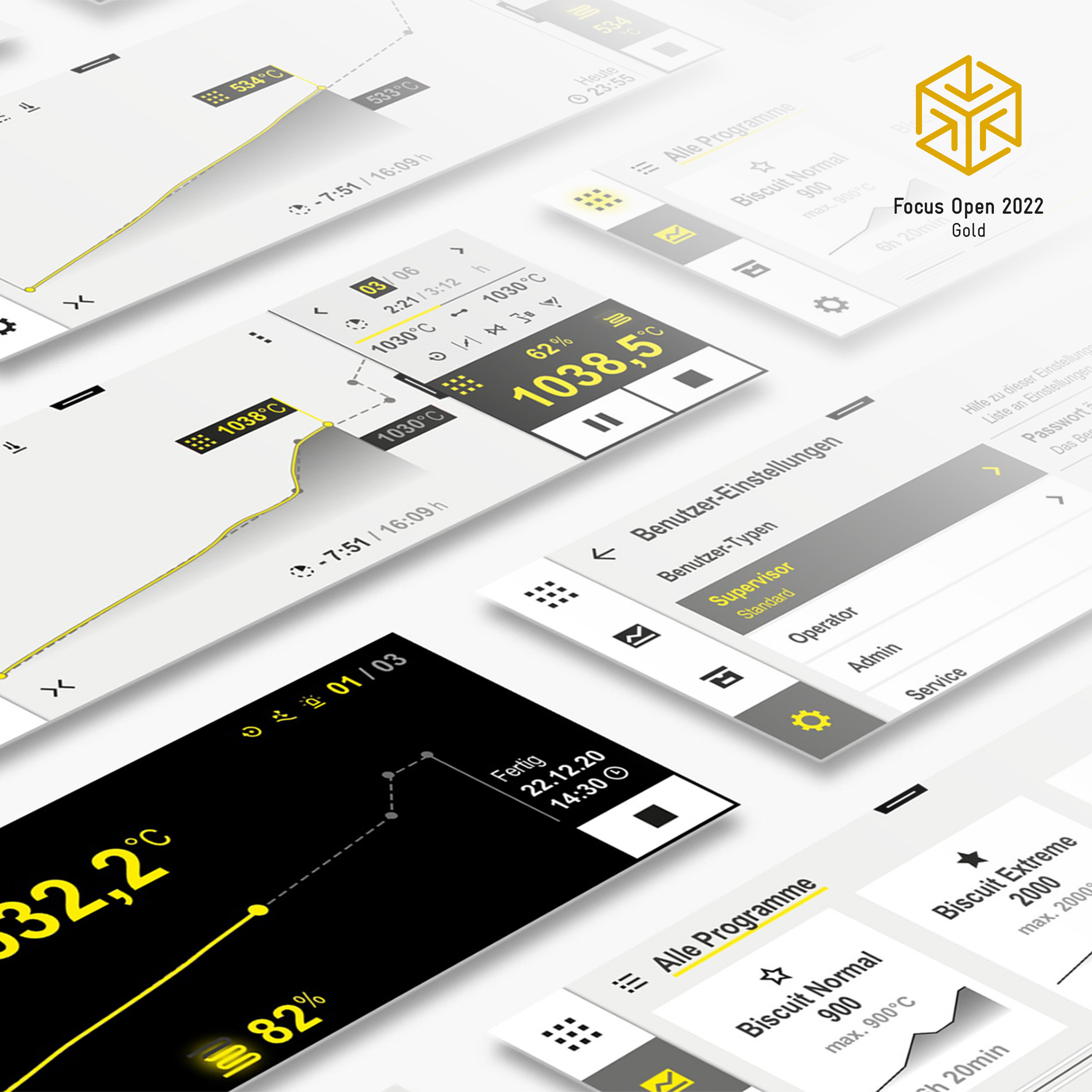
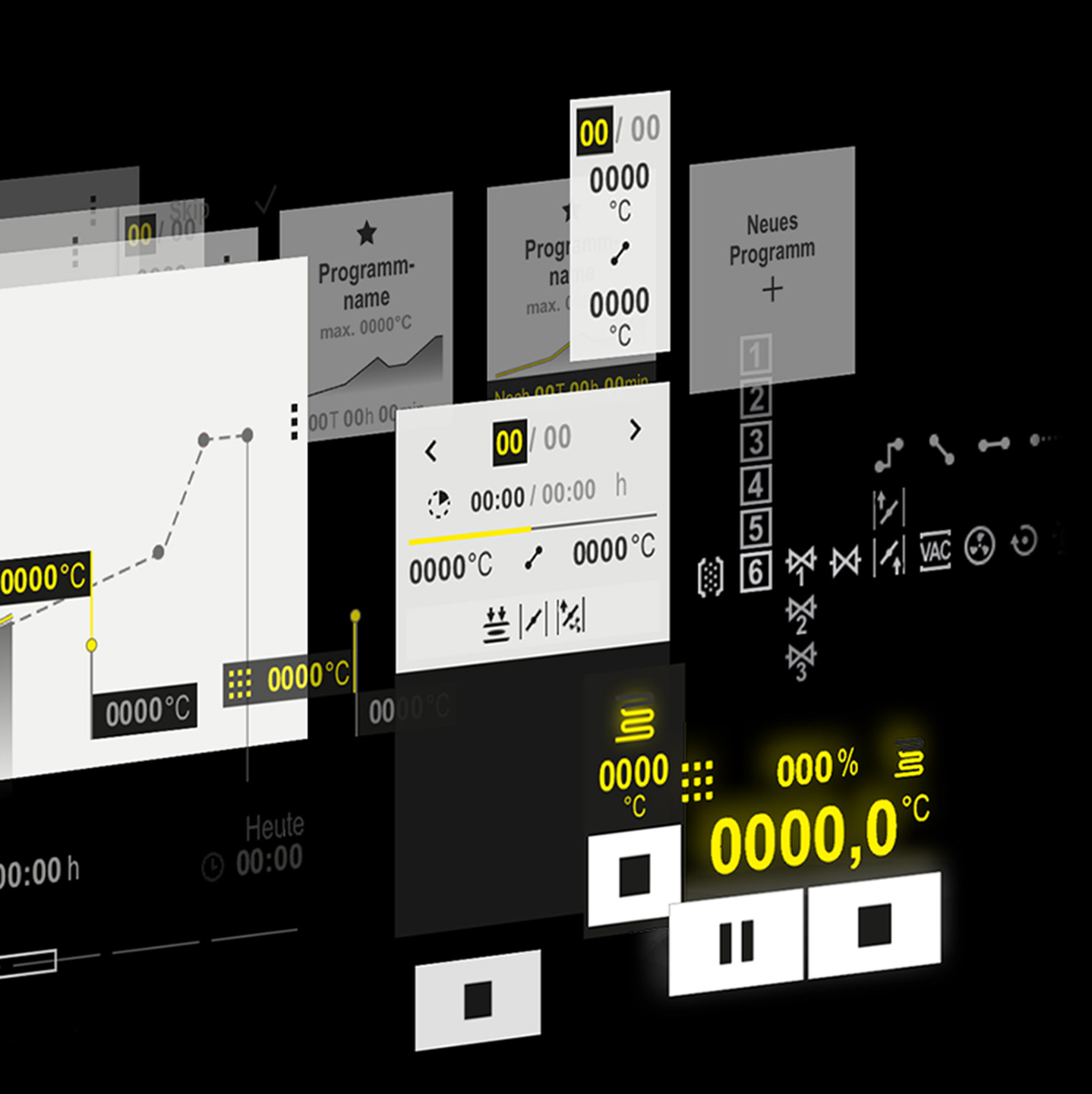
The task
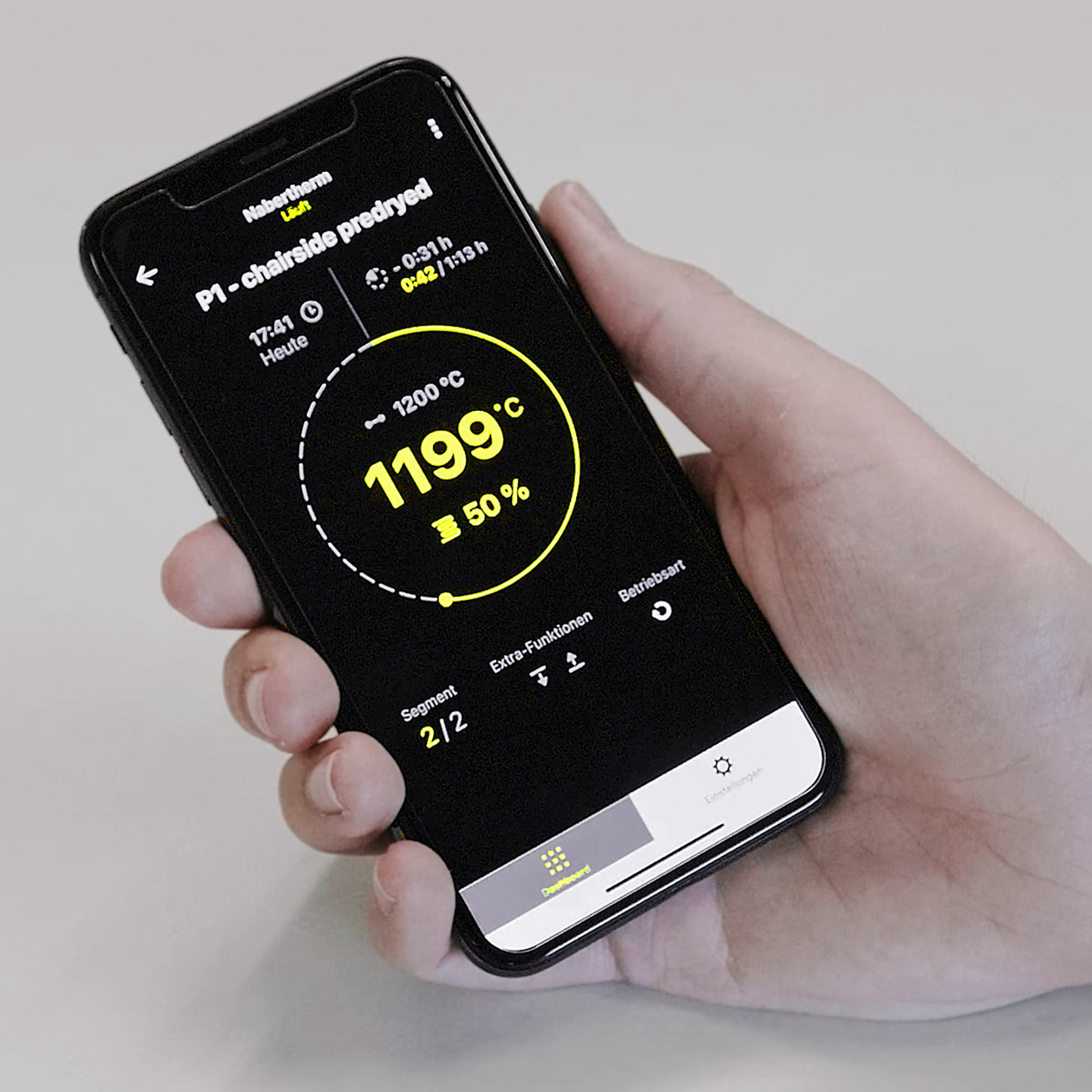
We already developed the UI design language for Nabertherm’s industrial furnaces and designed the associated stationary and mobile user interfaces. But the devil is in the details, as the future design language of the icons also needed to fit into this. The overall goal was to strengthen the brand in various contexts. Especially important here was the design of the app icon as it presents itself to the user like a business card.
The solution
With a design that is consistent down to the smallest detail, we didn’t leave a millimetre of the brand appearance to chance. We zoomed into the interface so that the customer experience takes place in the smallest possible space. We analysed exactly how we could extract the UI language onto the app icons. The in-app icons are designed according to a clear, no-frills approach, which is also reflected in the geometric play of shapes. In contrast to this, the brand-specific core elements were included in the app icon, while staying true to the image of thermal processes.